
Yasu
Objective
Yasu is a cloud optimization platform with impressive partnerships and technological strength. Using their AI agents, Yasu identifies cloud cost waste for their clients. However, with a launch out of stealth approaching, their website struggled to communicate their mission effectively. I was brought on board as the primary UX/UI Designer to help Yasu launch their website out of stealth before a vital investor meeting.
Yasu is a cloud optimization platform which uses agentic AI automation to identify cloud cost waste for their clients. However, with a launch out of stealth approaching, their website struggled to communicate their mission effectively. I was brought on board as the primary UX/UI Designer to help Yasu launch their website out of stealth before a vital investor meeting.
Yasu is a cloud optimization platform which uses agentic AI automation to identify cloud cost waste for their clients. However, with a launch out of stealth approaching, their website struggled to communicate their mission effectively. I was brought on board as the primary UX/UI Designer to help Yasu launch their website out of stealth before a vital investor meeting.
Yasu is a cloud optimization platform with impressive partnerships and technological strength. Using their AI agents, Yasu identifies cloud cost waste for their clients. However, with a launch out of stealth approaching, their website struggled to communicate their mission effectively. I was brought on board as the primary UX/UI Designer to help Yasu launch their website out of stealth before a vital investor meeting.
Problem
The original website lacked a coherent user journey. With dense content, little hierarchy - user flows are complex and unclear. The homepage failed to communicate Yasu’s unique value proposition, and the navigation paths were disorganized. As a result, first impressions suffered, and users were not converting as intended.
Yasu already had a consistent design system. As the UX Designer, my role was to redesign the site's information architecture and storytelling to improve clarity, engagement, and conversion while working within the constraints of the existing visual identity.
Research
Client interviews revealed that several meetings were required to understand the value of the product - adding pressure on the Yasu sales team.
Usability tests of their original website highlighted that the website is “confusing”, with too much competing information and a lack of a clear, consistent message. These tests and interviews revealed that cognitive overload and messaging gaps were undermining the website’s ability to inform and win clients.
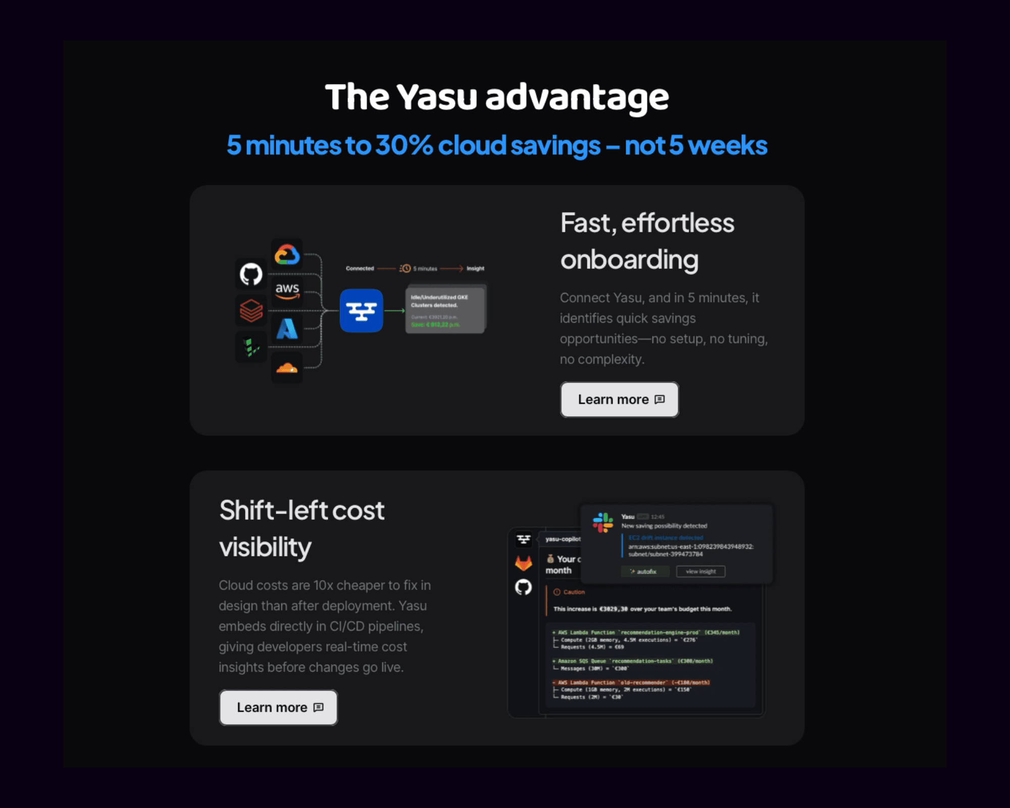
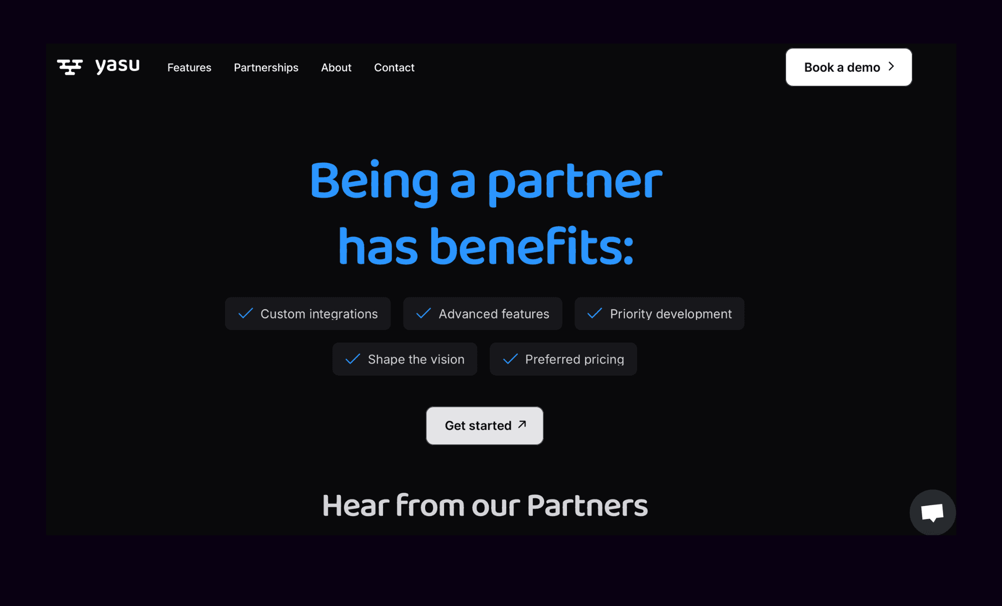
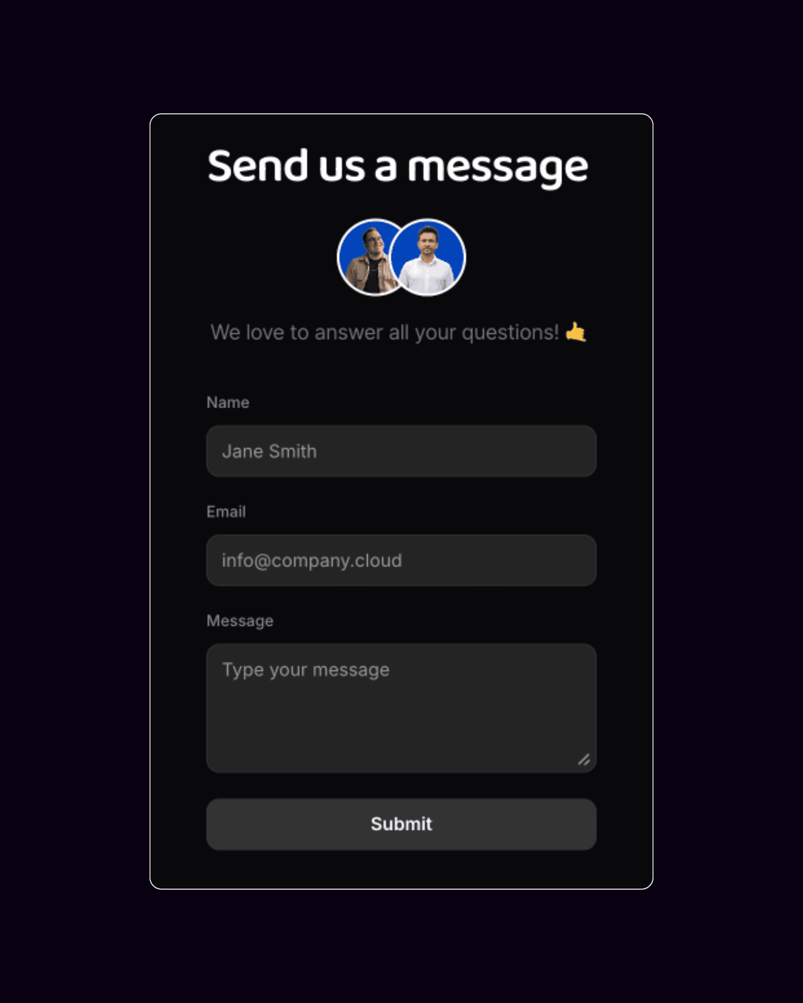
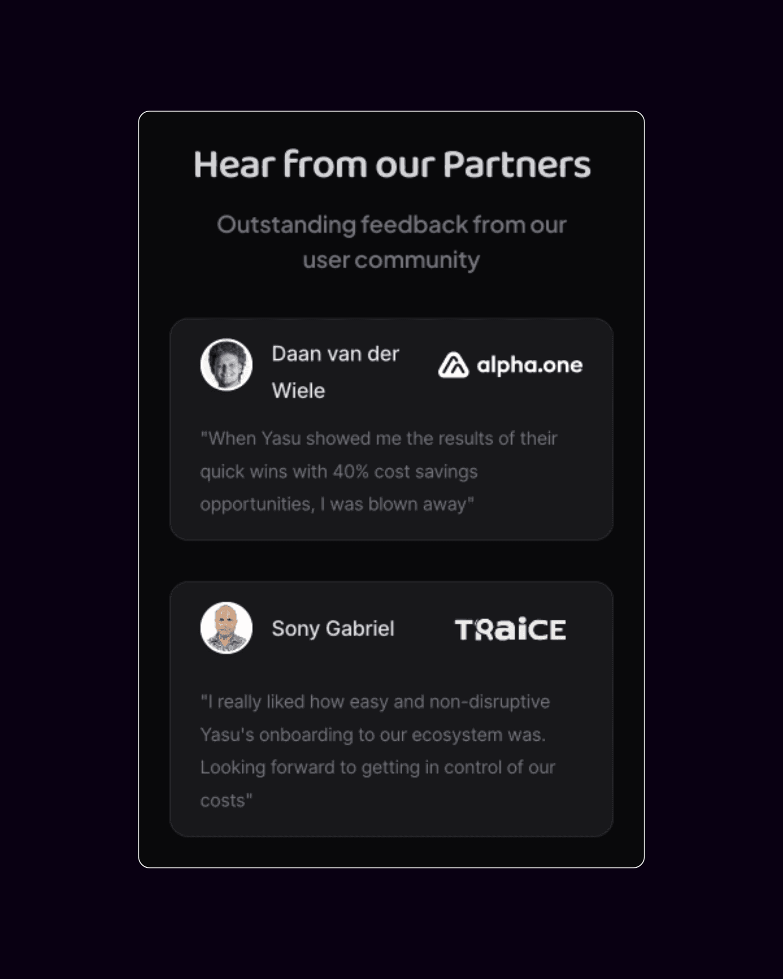
Content Flow
& wireframes
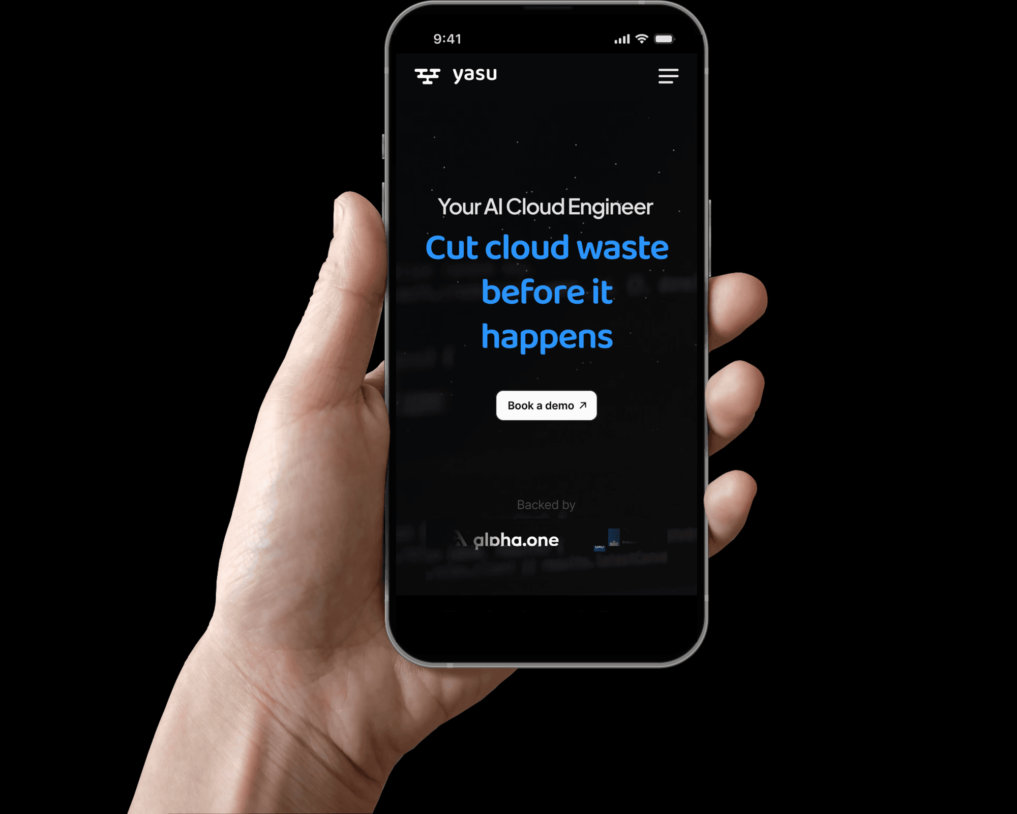
The deadline is approaching - so I made use of Framer's templates to work fast while customizing it to Yasu's needs. Broken into three 'chapters', the new layout guided users from value proposition through to action, along a frictionless path to learn more or book a demo.
Content flow
& wireframes
The deadline is approaching - so I made use of Framer's templates to work fast while customizing it to Yasu's needs. Broken into three 'chapters', the new layout guided users from value proposition through to action, along a frictionless path to learn more or book a demo.
Content flow
& wireframes
The deadline is approaching - so I made use of Framer's templates to work fast while customizing it to Yasu's needs. Broken into three 'chapters', the new layout guided users from value proposition through to action, along a frictionless path to learn more or book a demo.

Outcome
The redesigned site delivered a streamlined experience that helped users understand Yasu’s value within seconds. The updated site launched in May increasing engagement by 59% and visitors were spending more time on Yasu website than before.
Every little pixel and breakpoint was meticulousy examined to create seemless flows on both mobile and desktop. The result was a fluid, scalable design that performed as well on smaller screens as it did on large ones
Final thoughts
This project shows how impactful UX work can be—especially when the visual language is fixed but the message isn’t clear. By focusing on information architecture, narrative flow, and user intent, I helped transform Yasu’s website into a stronger strategic asset. My next task is to work on the Yasu SaaS AI tool, which is already proving to be very exciting.
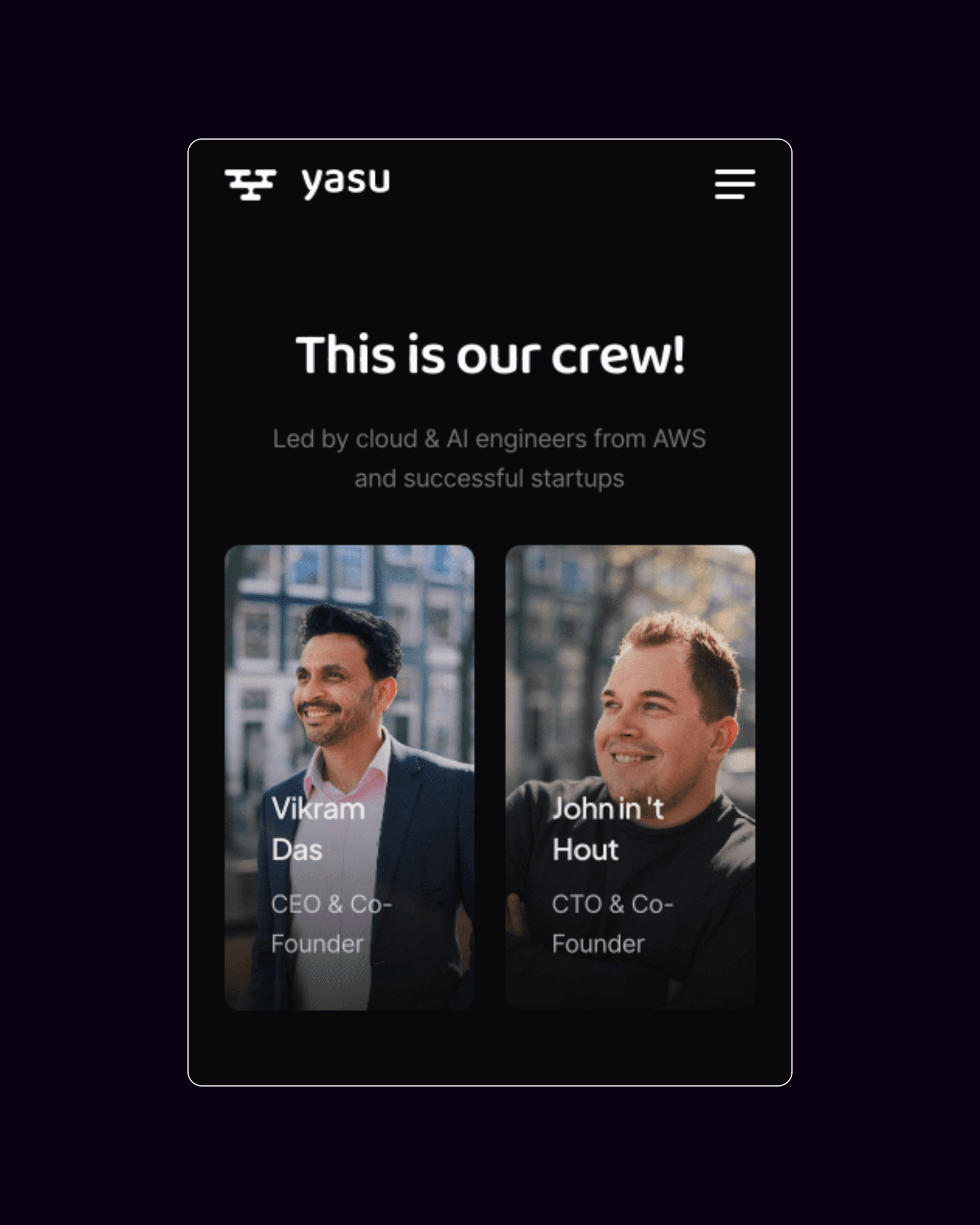
A huge thank you to both John and Vikram at Yasu for their trust.
Final thoughts
This project shows how impactful UX work can be; especially when the visual language is fixed but the message isn’t clear. By focusing on information architecture, narrative flow, and user intent, I helped transform Yasu’s website into a stronger strategic asset. My next task is to work on the Yasu SaaS AI tool, which is already proving to be very exciting.
It's been exciting working at Yasu - learning to work directly with the stakeholders, gaining feedback, usability testing and rolling out a product. A huge thank you to both John and Vikram at Yasu for their trust.
Let's chat
@2025 Adam Fitzsimons
Yasu
Objective
Yasu is a cloud optimization platform which uses agentic AI automation to identify cloud cost waste for their clients. However, with a launch out of stealth approaching, their website struggled to communicate their mission effectively. I was brought on board as the primary UX/UI Designer to help Yasu launch their website out of stealth before a vital investor meeting.
Problem
The original website lacked a coherent user journey. With dense content, little hierarchy - user flows are complex and unclear. The homepage failed to communicate Yasu’s unique value proposition, and the navigation paths were disorganized. As a result, first impressions suffered, and users were not converting as intended.Yasu already had a consistent design system. As the UX Designer, my role was to redesign the site's information architecture and storytelling to improve clarity, engagement, and conversion while working within the constraints of the existing visual identity.
Research
Client interviews revealed that several meetings were required to understand the value of the product - adding pressure on the Yasu sales team.
Usability tests of their original website highlighted that the website is “confusing”, with too much competing information and a lack of a clear, consistent message. These tests and interviews revealed that cognitive overload and messaging gaps were undermining the website’s ability to inform and win clients.
Content flow
& wireframes
The deadline is approaching - so I made use of Framer's templates to work fast while customizing it to Yasu's needs. Broken into three 'chapters', the new layout guided users from value proposition through to action, along a frictionless path to learn more or book a demo.
Outcome
The redesigned site delivered a streamlined experience that helped users understand Yasu’s value within seconds. The updated site launched in May increasing engagement by 59% and visitors were spending more time on Yasu website than before.
Every little pixel and breakpoint was meticulousy examined to create seemless flows on both mobile and desktop. The result was a fluid, scalable design that performed as well on smaller screens as it did on large ones
Final thoughts
This project shows how impactful UX work can be; especially when the visual language is fixed but the message isn’t clear. By focusing on information architecture, narrative flow, and user intent, I helped transform Yasu’s website into a stronger strategic asset. My next task is to work on the Yasu SaaS AI tool, which is already proving to be very exciting.
It's been exciting working at Yasu - learning to work directly with the stakeholders, gaining feedback, usability testing and rolling out a product. A huge thank you to both John and Vikram at Yasu for their trust.